Though the last couple of months have been pretty crazy with teaching, client work, and music, I have managed to focus in the last couple weeks on doing some reduction prints for an upcoming show at
The Arts Station in Fernie, in May 2011. I will also be holding a workshop in May (final date TBD) on the subject of woodcut prints,
contact me if you are interested.
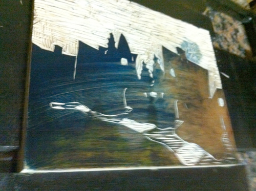
A reduction print is truly a limited edition because the print sees the artist destroying the original block as they progress through the printing process. The prints can vary in numbers of colour from 2 to up to 15 in some cases. There is a lot of planning that has to happen to do this and is very time-consuming but the results can be amazing.
Here are a couple of finished prints:

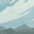
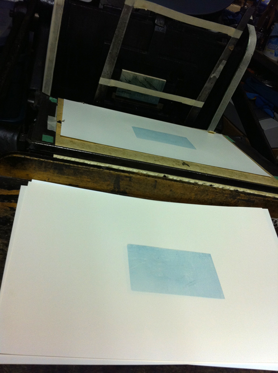
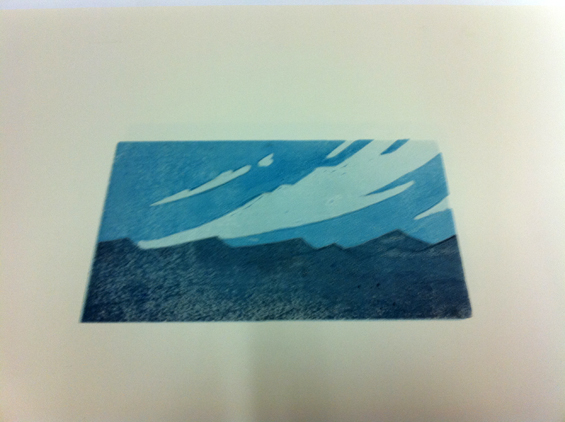
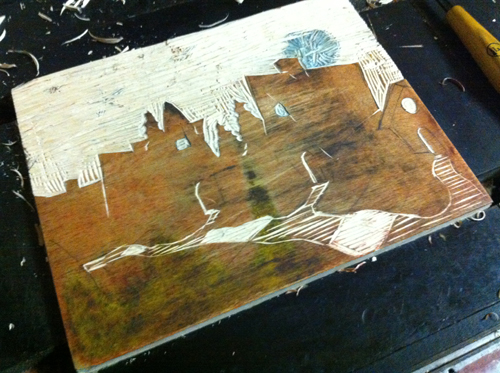
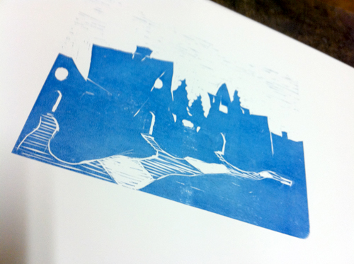
Since I’ve started playing with reduction prints, I’ve always thought that the process would work well with the multiple layers of foreground, hills, mountains, and sky you get when driving along the foothills of the rocky mountains. This particular scene is a generic assimilation of many typical elements: The wispy clouds, sharp peaks, and rolling hills settling down to the flat ranch-lands of Southern Alberta. The print is a 5 colour print where each layer is printed in a slightly darker blue, with a bit of red and black added towards the end in order to get the slight purplish hue of the foreground. The print itself is roughly 5″ x 3″ printed on a semi-gloss cream stock.

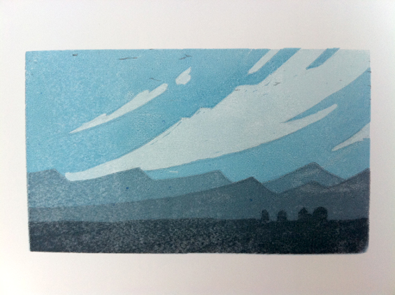
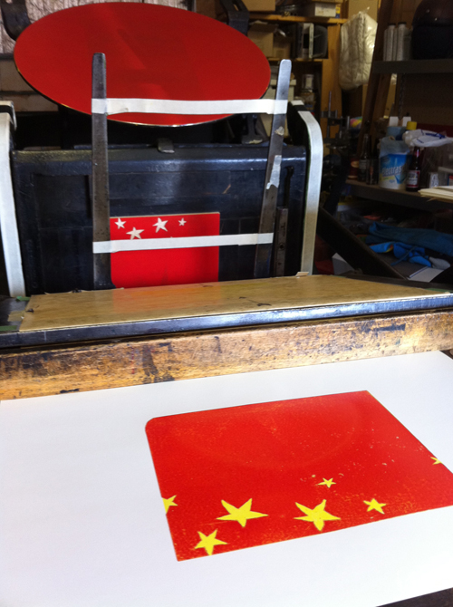
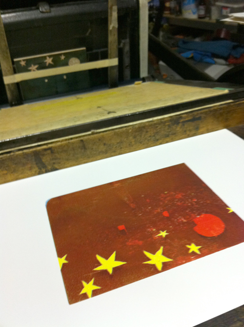
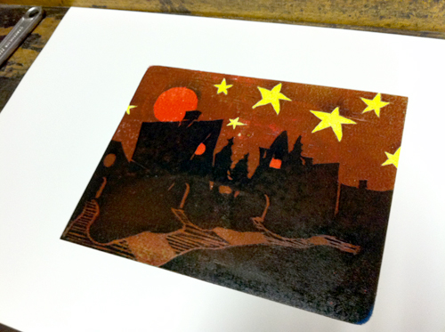
The second is based on a pastel I did years ago called ‘These Dark Houses’. I’ve always liked the moody depth of the original and thought it would translate well into a reduction print. I had to adjust the colours from the original blues and blacks to accommodate the first two layers being yellow and orange. The letterpress ink is an oil-based ink that is naturally quite translucent, so each layer shows through subsequent layers and affects the colour. This is again a five colour reduction print with yellow, orange, blue, darker blue, and black in that order. The final product came out with a very similar mood to the original but an entirely different palette.
If you’re in the neighbourhood come on out to the Arts Station sometime in the month of May and have a look at the art on display there. Both will be on sale there as well as on my
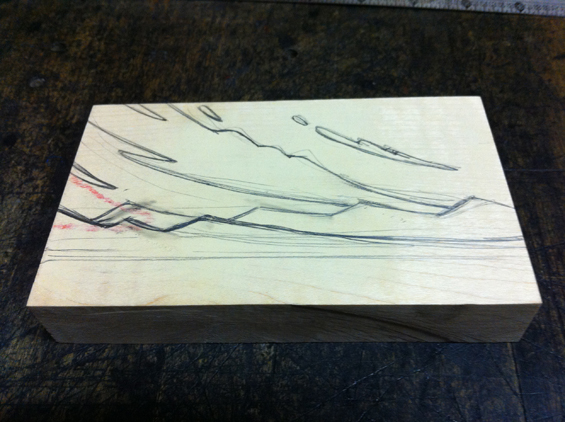
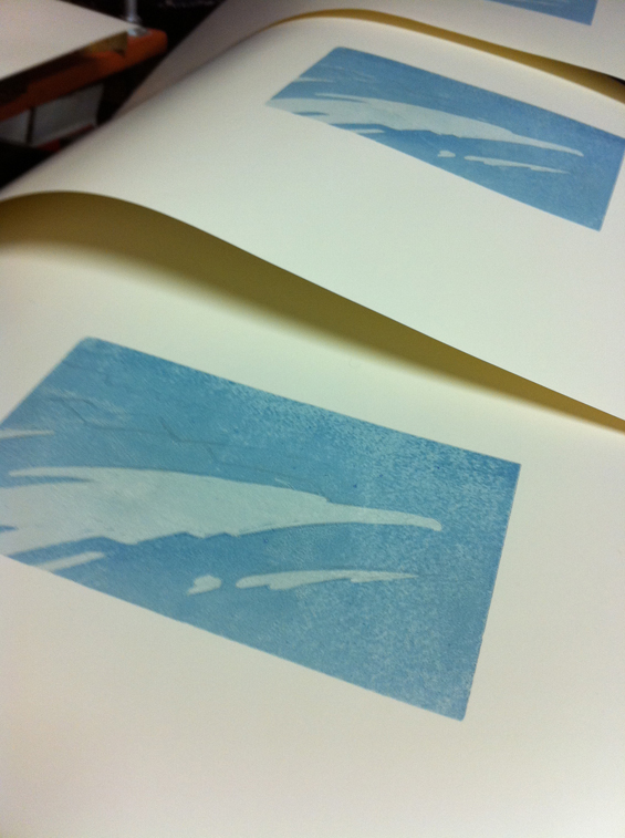
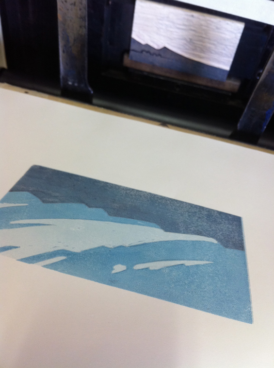
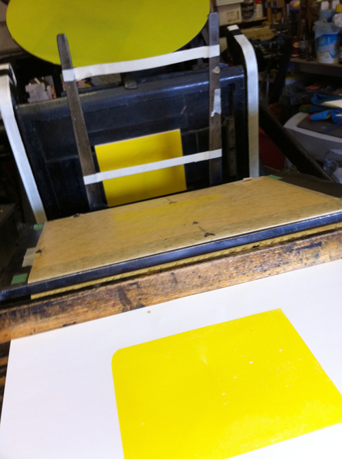
Etsy store. I’ve included some process images below so you can see them going together.
-m


Mike – this is so neat! I love it! if I can get out to Cranbrook in May – I would love to see some more of your work!
Sandy, Thanks for dropping by the site. You don’t even have to come as far as Cranbrook. I have a show running until May 28th at the Fernie Arts Station.